 zabloo
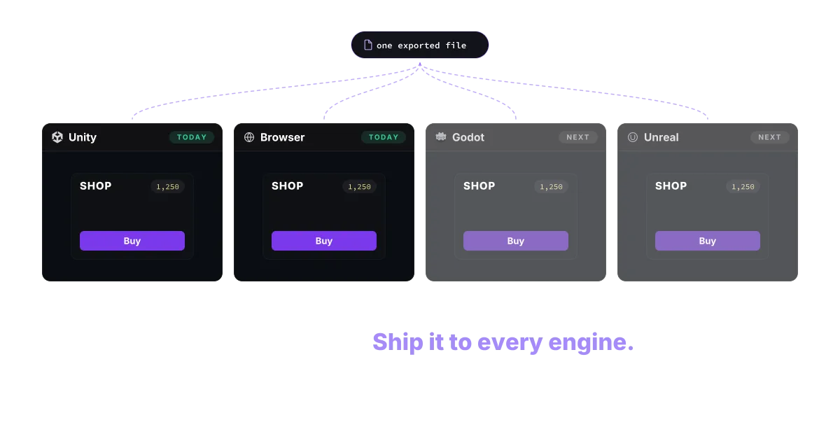
Learn UI once.Ship it to every engine.
Build your game's UI on the web, in React. Export once, and use it in your favourite game engine.
Real renderer
Components, driven live.
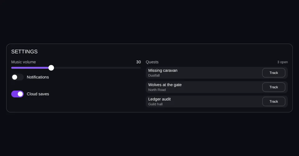
This is not a video. The frame runs the same renderer the SDK runs — it measures the layout itself, builds its own geometry, draws its own text — and a script is writing into the data paths the screen binds. Reach for it and the script stops: the panel beside the frame writes those same paths, and the console reads back the actions the UI hands the game.
Viewport: 960 × 500
- hover — off
- pressed — off
- focused — off
- selected — off
- disabled — off
Reported from the frame, not forced onto it.
The data, changing
- audio.music=30 → 80
- alerts.enabled=true
- quests[]=+= "Harbour blockade"
Each line lights as its write fires, and the frame answers in the same instant. That is the whole contract: your data in, layout out.
No frame drawn yet
import { Button, Column, List, Row, Slider, Switch, Text } from "@zabloo/react";


/** Fits the 310 px a 390-wide viewport leaves inside both paddings. */
const TRACK_LENGTH = 300;

const TRACK = { background: "{color.slot}", radius: "{radius.pill}" } as const;
const FILL = { background: "{color.brand}", radius: "{radius.pill}" } as const;
const THUMB = { background: "{color.text}", radius: "{radius.pill}" } as const;

const ROW = { background: "{color.slot}", radius: "{radius.md}" } as const;

export default function Settings() {
  return (
    <Column
      // `align: "stretch"` on the ROOT is what hands the panel the view's own
      // width; centring it would pin the panel to its content and no change of
      // viewport could reach it.
      layout={{ grow: 1, justify: "center", align: "stretch", padding: "{space.5}" }}
      style={{ background: "{color.bg}" }}
    >
      <Column
        id="panel"
        layout={{ padding: "{space.4}", gap: "{space.4}", align: "stretch" }}
        style={{
          background: "{color.surface}",
          radius: "{radius.lg}",
          borderWidth: "{border.hairline}",
          borderColor: "{color.line}",
        }}
      >
        <Text style={{ color: "{color.text}", fontSize: "{text.lg}" }}>SETTINGS</Text>

        {/* The node that answers the viewport: two columns with a width, so the
            wrap point is arithmetic. 300 + 16 + 340 = 656 fits the 872 a desktop
            leaves and does not fit the 302 a phone does. */}
        <Row layout={{ wrap: true, gap: "{space.4}", align: "start" }}>
          <Column layout={{ width: 300, grow: 1, gap: "{space.4}", align: "stretch" }}>
            <Column layout={{ gap: "{space.2}", align: "stretch" }}>
              <Row layout={{ justify: "space-between", align: "center" }}>
                <Text style={{ color: "{color.muted}", fontSize: "{text.sm}" }}>Music volume</Text>
                {/* Same path as the slider below. The readout follows the game's
                    write and the player's drag alike, because both are the data. */}
                <Text bind="audio.music" style={{ color: "{color.text}", fontSize: "{text.sm}" }} />
              </Row>
              <Slider
                id="music"
                value={{ bind: "audio.music" }}
                min={0}
                max={100}
                step={1}
                onChange="music-preview"
                onCommit="music-apply"
                length={TRACK_LENGTH}
                style={TRACK}
                fill={FILL}
                thumb={THUMB}
              />
            </Column>

            <Switch
              id="alerts"
              checked={{ bind: "alerts.enabled" }}
              onChange="alerts-changed"
              track={{ background: "{color.slot}", radius: "{radius.pill}" }}
              checkedTrack={{ background: "{color.brand-strong}" }}
              knob={{ background: "{color.text}", radius: "{radius.pill}" }}
            >
              <Text style={{ color: "{color.text}", fontSize: "{text.sm}" }}>Notifications</Text>
            </Switch>

            {/* Nought or one item: with an empty array this list holds no rows
                and takes no height, and the row that arrives pushes everything
                under it down. No empty slot — "nothing to say" is the honest
                shape of a digest that is switched off. */}
            <List
              items="alerts.digest"
              as="d"
              keyPath="id"
              layout={{ gap: "{space.2}", align: "stretch" }}
            >
              {(d) => (
                <Row
                  layout={{ padding: "{space.2}", align: "center" }}
                  style={{
                    background: "{color.brand-soft}",
                    radius: "{radius.md}",
                    borderWidth: "{border.hairline}",
                    borderColor: "{color.brand}",
                  }}
                >
                  <Text
                    bind={d("label")}
                    style={{ color: "{color.text}", fontSize: "{text.xs}" }}
                  />
                </Row>
              )}
            </List>

            {/* What the digest row pushes down when it arrives. A layout that
                re-flows has to have something under the change, or "it enters
                the flow" is a claim nothing on screen can confirm. */}
            <Switch
              id="cloud"
              checked={{ bind: "saves.cloud" }}
              onChange="cloud-changed"
              track={{ background: "{color.slot}", radius: "{radius.pill}" }}
              checkedTrack={{ background: "{color.brand-strong}" }}
              knob={{ background: "{color.text}", radius: "{radius.pill}" }}
            >
              <Text style={{ color: "{color.text}", fontSize: "{text.sm}" }}>Cloud saves</Text>
            </Switch>
          </Column>

          <Column layout={{ width: 340, grow: 1, gap: "{space.2}", align: "stretch" }}>
            <Row layout={{ justify: "space-between", align: "center" }}>
              <Text style={{ color: "{color.muted}", fontSize: "{text.sm}" }}>Quests</Text>
              <Text bind="quests.count" style={{ color: "{color.faint}", fontSize: "{text.xs}" }} />
            </Row>

            {/* One template, instantiated per element. The row the demo appends
                is not a different node — it is this one, with one more item in
                the array. */}
            <List
              items="quests.open"
              as="q"
              keyPath="id"
              layout={{ gap: "{space.2}", align: "stretch" }}
              empty={
                <Text style={{ color: "{color.faint}", fontSize: "{text.sm}" }}>
                  No quests in your log
                </Text>
              }
            >
              {(q) => (
                <Row
                  layout={{ height: 38, padding: "{space.2}", gap: "{space.3}", align: "center" }}
                  style={ROW}
                >
                  <Column layout={{ grow: 1, gap: 2 }}>
                    <Text
                      bind={q("name")}
                      style={{ color: "{color.text}", fontSize: "{text.sm}" }}
                    />
                    {/* Where the arrival announces itself: the game writes
                        "just landed" here, then the item's real area a second
                        later. A style could not carry that — v1 binds data. */}
                    <Text
                      bind={q("area")}
                      style={{ color: "{color.faint}", fontSize: "{text.xs}" }}
                    />
                  </Column>
                  {/* One action for the whole list; which row it came from
                      travels in the action's context. */}
                  <Button
                    variant="secondary"
                    onClick="track"
                    layout={{ width: 74, height: 30, justify: "center", align: "center" }}
                  >
                    <Text style={{ color: "{color.text}", fontSize: "{text.xs}" }}>Track</Text>
                  </Button>
                </Row>
              )}
            </List>
          </Column>
        </Row>
      </Column>
    </Column>
  );
}
{
"v": 1,
"tokens": {
"color.bg": "#0b0d13",
"color.surface": "#0e1016",
"color.raised": "#14141a",
"color.line": "#ffffff1f",
"color.line-strong": "#ffffff24",
"color.text": "#ffffff",
"color.muted": "#a1a1aa",
"color.faint": "#8a8a93",
"color.on-brand": "#ffffff",
"color.brand": "#8b5cf6",
"color.brand-strong": "#7c3aed",
"color.brand-hover": "#8b5cf6",
"color.brand-pressed": "#6d28d9",
"color.brand-soft": "#8b5cf61f",
"color.gold": "#fcd34d",
"color.slot": "#ffffff08",
"color.danger": "#f87171",
"radius.sm": 6,
"radius.md": 10,
"radius.lg": 14,
"radius.pill": 999,
"border.hairline": 1,
"border.focus": 2,
"space.1": 4,
"space.2": 8,
"space.3": 12,
"space.4": 16,
"space.5": 20,
"space.6": 24,
"text.xs": 11,
"text.sm": 13,
"text.md": 15,
"text.lg": 17,
"motion.fast": 120,
"motion.loop": 900
},
"views": {
"settings": {
"type": "Container",
"layout": {
"direction": "column",
"grow": 1,
"justify": "center",
"align": "stretch",
"padding": "{space.5}"
},
"style": {
"background": "{color.bg}"
},
"children": [
{
"type": "Container",
"id": "panel",
"layout": {
"direction": "column",
"padding": "{space.4}",
"gap": "{space.4}",
"align": "stretch"
},
"style": {
"background": "{color.surface}",
"radius": "{radius.lg}",
"borderWidth": "{border.hairline}",
"borderColor": "{color.line}"
},
"children": [
{
"type": "Text",
"style": {
"color": "{color.text}",
"fontSize": "{text.lg}"
},
"text": "SETTINGS"
},
{
"type": "Container",
"layout": {
"direction": "row",
"wrap": true,
"gap": "{space.4}",
"align": "start"
},
"children": [
{
"type": "Container",
"layout": {
"direction": "column",
"width": 300,
"grow": 1,
"gap": "{space.4}",
"align": "stretch"
},
"children": [
{
"type": "Container",
"layout": {
"direction": "column",
"gap": "{space.2}",
"align": "stretch"
},
"children": [
{
"type": "Container",
"layout": {
"direction": "row",
"justify": "space-between",
"align": "center"
},
"children": [
{
"type": "Text",
"style": {
"color": "{color.muted}",
"fontSize": "{text.sm}"
},
"text": "Music volume"
},
{
"type": "Text",
"style": {
"color": "{color.text}",
"fontSize": "{text.sm}"
},
"text": {
"bind": "audio.music"
}
}
]
},
{
"type": "Slider",
"id": "music",
"layout": {
"width": 300,
"height": 6
},
"style": {
"radius": "{radius.pill}",
"background": "{color.slot}"
},
"value": {
"bind": "audio.music"
},
"min": 0,
"max": 100,
"step": 1,
"onChange": "music-preview",
"onCommit": "music-apply",
"children": [
{
"type": "Container",
"layout": {
"height": 6
},
"style": {
"radius": "{radius.pill}",
"background": "{color.brand}"
}
},
{
"type": "Container",
"layout": {
"width": 18,
"height": 18
},
"style": {
"radius": "{radius.pill}",
"background": "{color.text}"
}
}
]
}
]
},
{
"type": "Toggle",
"id": "alerts",
"layout": {
"direction": "row",
"align": "center",
"gap": 10
},
"checked": {
"bind": "alerts.enabled"
},
"onChange": "alerts-changed",
"children": [
{
"type": "Container",
"layout": {
"direction": "row",
"width": 40,
"height": 22,
"padding": 3,
"justify": "end",
"align": "center"
},
"style": {
"radius": "{radius.pill}",
"background": "{color.brand-strong}"
},
"children": [
{
"type": "Container",
"layout": {
"width": 16,
"height": 16
},
"style": {
"radius": "{radius.pill}",
"background": "{color.text}"
}
}
]
},
{
"type": "Container",
"layout": {
"direction": "row",
"width": 40,
"height": 22,
"padding": 3,
"justify": "start",
"align": "center"
},
"style": {
"radius": "{radius.pill}",
"background": "{color.slot}"
},
"children": [
{
"type": "Container",
"layout": {
"width": 16,
"height": 16
},
"style": {
"radius": "{radius.pill}",
"background": "{color.text}"
}
}
]
},
{
"type": "Text",
"style": {
"color": "{color.text}",
"fontSize": "{text.sm}"
},
"text": "Notifications"
}
]
},
{
"type": "Repeat",
"layout": {
"direction": "column",
"gap": "{space.2}",
"align": "stretch"
},
"items": {
"bind": "alerts.digest"
},
"as": "d",
"key": "id",
"children": [
{
"type": "Container",
"layout": {
"direction": "row",
"padding": "{space.2}",
"align": "center"
},
"style": {
"background": "{color.brand-soft}",
"radius": "{radius.md}",
"borderWidth": "{border.hairline}",
"borderColor": "{color.brand}"
},
"children": [
{
"type": "Text",
"style": {
"color": "{color.text}",
"fontSize": "{text.xs}"
},
"text": {
"bind": "d.label"
}
}
]
}
]
},
{
"type": "Toggle",
"id": "cloud",
"layout": {
"direction": "row",
"align": "center",
"gap": 10
},
"checked": {
"bind": "saves.cloud"
},
"onChange": "cloud-changed",
"children": [
{
"type": "Container",
"layout": {
"direction": "row",
"width": 40,
"height": 22,
"padding": 3,
"justify": "end",
"align": "center"
},
"style": {
"radius": "{radius.pill}",
"background": "{color.brand-strong}"
},
"children": [
{
"type": "Container",
"layout": {
"width": 16,
"height": 16
},
"style": {
"radius": "{radius.pill}",
"background": "{color.text}"
}
}
]
},
{
"type": "Container",
"layout": {
"direction": "row",
"width": 40,
"height": 22,
"padding": 3,
"justify": "start",
"align": "center"
},
"style": {
"radius": "{radius.pill}",
"background": "{color.slot}"
},
"children": [
{
"type": "Container",
"layout": {
"width": 16,
"height": 16
},
"style": {
"radius": "{radius.pill}",
"background": "{color.text}"
}
}
]
},
{
"type": "Text",
"style": {
"color": "{color.text}",
"fontSize": "{text.sm}"
},
"text": "Cloud saves"
}
]
}
]
},
{
"type": "Container",
"layout": {
"direction": "column",
"width": 340,
"grow": 1,
"gap": "{space.2}",
"align": "stretch"
},
"children": [
{
"type": "Container",
"layout": {
"direction": "row",
"justify": "space-between",
"align": "center"
},
"children": [
{
"type": "Text",
"style": {
"color": "{color.muted}",
"fontSize": "{text.sm}"
},
"text": "Quests"
},
{
"type": "Text",
"style": {
"color": "{color.faint}",
"fontSize": "{text.xs}"
},
"text": {
"bind": "quests.count"
}
}
]
},
{
"type": "Repeat",
"layout": {
"direction": "column",
"gap": "{space.2}",
"align": "stretch"
},
"items": {
"bind": "quests.open"
},
"as": "q",
"key": "id",
"children": [
{
"type": "Container",
"layout": {
"direction": "row",
"height": 38,
"padding": "{space.2}",
"gap": "{space.3}",
"align": "center"
},
"style": {
"background": "{color.slot}",
"radius": "{radius.md}"
},
"children": [
{
"type": "Container",
"layout": {
"direction": "column",
"grow": 1,
"gap": 2
},
"children": [
{
"type": "Text",
"style": {
"color": "{color.text}",
"fontSize": "{text.sm}"
},
"text": {
"bind": "q.name"
}
},
{
"type": "Text",
"style": {
"color": "{color.faint}",
"fontSize": "{text.xs}"
},
"text": {
"bind": "q.area"
}
}
]
},
{
"type": "Button",
"layout": {
"width": 74,
"height": 30,
"justify": "center",
"align": "center"
},
"style": {
"background": "#00000000",
"borderWidth": "{border.hairline}",
"borderColor": "{color.line-strong}",
"radius": "{radius.md}",
"color": "{color.text}"
},
"states": {
"hover": {
"style": {
"background": "{color.slot}"
}
},
"pressed": {
"style": {
"background": "{color.brand-soft}"
}
},
"focused": {
"style": {
"borderWidth": "{border.focus}",
"borderColor": "{color.brand}"
}
},
"disabled": {
"style": {
"opacity": 0.45
}
}
},
"transition": {
"duration": "{motion.fast}"
},
"onClick": "track",
"children": [
{
"type": "Text",
"style": {
"color": "{color.text}",
"fontSize": "{text.xs}"
},
"text": "Track"
}
]
}
]
},
{
"type": "Text",
"style": {
"color": "{color.faint}",
"fontSize": "{text.sm}"
},
"text": "No quests in your log"
}
]
}
]
}
]
}
]
}
]
}
}
}Layout
A Flexbox subset every target implements identically. The row that arrives pushes the layout because the layout is measured, never baked.
Bindings
Text, values and checked state read from data paths the game owns. The volume above is one path, read by the slider and the number beside it.
Named actions
The UI fires names, not callbacks. The game subscribes to “track” and never learns what drew the button that sent it.
Tokens, reloaded
One screen. Four skins. No rebuild.
The same panel from the section above, re-skinned live. Every switch below hands the running view a new payload — the SDK's own hot-update call — carrying the same screen with a different dictionary. Colour, corner radius, spacing, transition length and the type scale are all values in that file, which is why changing the type resizes the words and re-flows the panel around them.
handle.reload(…)
Each palette is checked against itself at build time: no skin ships text this site cannot read.
Tokens
Colours, spacing, radii and durations resolve through a dictionary the file carries. Reskinning is new data, not a screen anyone reopened.
Degradation
An SDK older than the content it receives is a normal case. Unknown nodes fall back by rule, and a payload the reader refuses leaves the screen it was already showing exactly as it was.
In the engine
Load one file. Hear the actions.
A ZablooDocument on a GameObject holds the exported file and draws it; a script beside it hears the actions and pushes the data. That is the whole integration surface. The SDK owns drawing and input; your game owns the data and what a name means.
- One component per screen, not a prefab tree
- One draw path, whatever the screen
- Swap the file at runtime, keep the session
[RequireComponent(typeof(ZablooDocument))]
public sealed class ShopDriver : MonoBehaviour
{
    ZablooDocument _doc;

    void Start()
    {
        _doc = GetComponent<ZablooDocument>();
        _doc.OnAction += OnZablooAction;
        _doc.SetData("player.gold", 1250);
    }

    void OnZablooAction(string action)
    {
        if (action == "buy") Economy.Purchase();
    }
}
Put your UI on the next build.
The SDK is open source and free. Start with a screen and see how far it takes you.