 zabloo
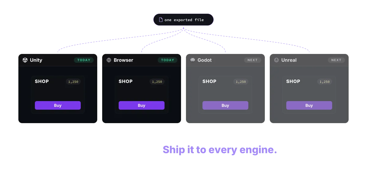
Aprende UI una vez.Publícala en todos los motores.
Construye la UI de tu juego en la web, con React. Expórtala una vez y úsala en tu motor favorito.
Renderer real
Componentes, movidos en vivo.
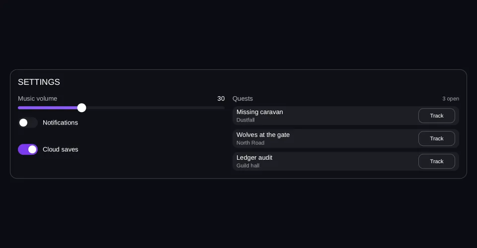
Esto no es un vídeo. El marco ejecuta el mismo renderer que ejecuta el SDK —mide el layout, construye su propia geometría y dibuja su propio texto— y un script está escribiendo en las rutas de datos que la pantalla enlaza. En cuanto lo tocas, el script se detiene: el panel de al lado escribe esas mismas rutas y la consola lee las acciones que la UI le devuelve al juego.
Viewport: 960 × 500
- hover — inactivo
- pressed — inactivo
- focused — inactivo
- selected — inactivo
- disabled — inactivo
Se leen del marco, no se le imponen.
Los datos, cambiando
- audio.music=30 → 80
- alerts.enabled=true
- quests[]=+= "Harbour blockade"
Cada línea se enciende cuando su escritura se dispara, y el marco responde en ese mismo instante. Ese es todo el contrato: tus datos entran, sale layout.
Aún no se ha dibujado ningún frame
import { Button, Column, List, Row, Slider, Switch, Text } from "@zabloo/react";


/** Fits the 310 px a 390-wide viewport leaves inside both paddings. */
const TRACK_LENGTH = 300;

const TRACK = { background: "{color.slot}", radius: "{radius.pill}" } as const;
const FILL = { background: "{color.brand}", radius: "{radius.pill}" } as const;
const THUMB = { background: "{color.text}", radius: "{radius.pill}" } as const;

const ROW = { background: "{color.slot}", radius: "{radius.md}" } as const;

export default function Settings() {
  return (
    <Column
      // `align: "stretch"` on the ROOT is what hands the panel the view's own
      // width; centring it would pin the panel to its content and no change of
      // viewport could reach it.
      layout={{ grow: 1, justify: "center", align: "stretch", padding: "{space.5}" }}
      style={{ background: "{color.bg}" }}
    >
      <Column
        id="panel"
        layout={{ padding: "{space.4}", gap: "{space.4}", align: "stretch" }}
        style={{
          background: "{color.surface}",
          radius: "{radius.lg}",
          borderWidth: "{border.hairline}",
          borderColor: "{color.line}",
        }}
      >
        <Text style={{ color: "{color.text}", fontSize: "{text.lg}" }}>SETTINGS</Text>

        {/* The node that answers the viewport: two columns with a width, so the
            wrap point is arithmetic. 300 + 16 + 340 = 656 fits the 872 a desktop
            leaves and does not fit the 302 a phone does. */}
        <Row layout={{ wrap: true, gap: "{space.4}", align: "start" }}>
          <Column layout={{ width: 300, grow: 1, gap: "{space.4}", align: "stretch" }}>
            <Column layout={{ gap: "{space.2}", align: "stretch" }}>
              <Row layout={{ justify: "space-between", align: "center" }}>
                <Text style={{ color: "{color.muted}", fontSize: "{text.sm}" }}>Music volume</Text>
                {/* Same path as the slider below. The readout follows the game's
                    write and the player's drag alike, because both are the data. */}
                <Text bind="audio.music" style={{ color: "{color.text}", fontSize: "{text.sm}" }} />
              </Row>
              <Slider
                id="music"
                value={{ bind: "audio.music" }}
                min={0}
                max={100}
                step={1}
                onChange="music-preview"
                onCommit="music-apply"
                length={TRACK_LENGTH}
                style={TRACK}
                fill={FILL}
                thumb={THUMB}
              />
            </Column>

            <Switch
              id="alerts"
              checked={{ bind: "alerts.enabled" }}
              onChange="alerts-changed"
              track={{ background: "{color.slot}", radius: "{radius.pill}" }}
              checkedTrack={{ background: "{color.brand-strong}" }}
              knob={{ background: "{color.text}", radius: "{radius.pill}" }}
            >
              <Text style={{ color: "{color.text}", fontSize: "{text.sm}" }}>Notifications</Text>
            </Switch>

            {/* Nought or one item: with an empty array this list holds no rows
                and takes no height, and the row that arrives pushes everything
                under it down. No empty slot — "nothing to say" is the honest
                shape of a digest that is switched off. */}
            <List
              items="alerts.digest"
              as="d"
              keyPath="id"
              layout={{ gap: "{space.2}", align: "stretch" }}
            >
              {(d) => (
                <Row
                  layout={{ padding: "{space.2}", align: "center" }}
                  style={{
                    background: "{color.brand-soft}",
                    radius: "{radius.md}",
                    borderWidth: "{border.hairline}",
                    borderColor: "{color.brand}",
                  }}
                >
                  <Text
                    bind={d("label")}
                    style={{ color: "{color.text}", fontSize: "{text.xs}" }}
                  />
                </Row>
              )}
            </List>

            {/* What the digest row pushes down when it arrives. A layout that
                re-flows has to have something under the change, or "it enters
                the flow" is a claim nothing on screen can confirm. */}
            <Switch
              id="cloud"
              checked={{ bind: "saves.cloud" }}
              onChange="cloud-changed"
              track={{ background: "{color.slot}", radius: "{radius.pill}" }}
              checkedTrack={{ background: "{color.brand-strong}" }}
              knob={{ background: "{color.text}", radius: "{radius.pill}" }}
            >
              <Text style={{ color: "{color.text}", fontSize: "{text.sm}" }}>Cloud saves</Text>
            </Switch>
          </Column>

          <Column layout={{ width: 340, grow: 1, gap: "{space.2}", align: "stretch" }}>
            <Row layout={{ justify: "space-between", align: "center" }}>
              <Text style={{ color: "{color.muted}", fontSize: "{text.sm}" }}>Quests</Text>
              <Text bind="quests.count" style={{ color: "{color.faint}", fontSize: "{text.xs}" }} />
            </Row>

            {/* One template, instantiated per element. The row the demo appends
                is not a different node — it is this one, with one more item in
                the array. */}
            <List
              items="quests.open"
              as="q"
              keyPath="id"
              layout={{ gap: "{space.2}", align: "stretch" }}
              empty={
                <Text style={{ color: "{color.faint}", fontSize: "{text.sm}" }}>
                  No quests in your log
                </Text>
              }
            >
              {(q) => (
                <Row
                  layout={{ height: 38, padding: "{space.2}", gap: "{space.3}", align: "center" }}
                  style={ROW}
                >
                  <Column layout={{ grow: 1, gap: 2 }}>
                    <Text
                      bind={q("name")}
                      style={{ color: "{color.text}", fontSize: "{text.sm}" }}
                    />
                    {/* Where the arrival announces itself: the game writes
                        "just landed" here, then the item's real area a second
                        later. A style could not carry that — v1 binds data. */}
                    <Text
                      bind={q("area")}
                      style={{ color: "{color.faint}", fontSize: "{text.xs}" }}
                    />
                  </Column>
                  {/* One action for the whole list; which row it came from
                      travels in the action's context. */}
                  <Button
                    variant="secondary"
                    onClick="track"
                    layout={{ width: 74, height: 30, justify: "center", align: "center" }}
                  >
                    <Text style={{ color: "{color.text}", fontSize: "{text.xs}" }}>Track</Text>
                  </Button>
                </Row>
              )}
            </List>
          </Column>
        </Row>
      </Column>
    </Column>
  );
}
{
"v": 1,
"tokens": {
"color.bg": "#0b0d13",
"color.surface": "#0e1016",
"color.raised": "#14141a",
"color.line": "#ffffff1f",
"color.line-strong": "#ffffff24",
"color.text": "#ffffff",
"color.muted": "#a1a1aa",
"color.faint": "#8a8a93",
"color.on-brand": "#ffffff",
"color.brand": "#8b5cf6",
"color.brand-strong": "#7c3aed",
"color.brand-hover": "#8b5cf6",
"color.brand-pressed": "#6d28d9",
"color.brand-soft": "#8b5cf61f",
"color.gold": "#fcd34d",
"color.slot": "#ffffff08",
"color.danger": "#f87171",
"radius.sm": 6,
"radius.md": 10,
"radius.lg": 14,
"radius.pill": 999,
"border.hairline": 1,
"border.focus": 2,
"space.1": 4,
"space.2": 8,
"space.3": 12,
"space.4": 16,
"space.5": 20,
"space.6": 24,
"text.xs": 11,
"text.sm": 13,
"text.md": 15,
"text.lg": 17,
"motion.fast": 120,
"motion.loop": 900
},
"views": {
"settings": {
"type": "Container",
"layout": {
"direction": "column",
"grow": 1,
"justify": "center",
"align": "stretch",
"padding": "{space.5}"
},
"style": {
"background": "{color.bg}"
},
"children": [
{
"type": "Container",
"id": "panel",
"layout": {
"direction": "column",
"padding": "{space.4}",
"gap": "{space.4}",
"align": "stretch"
},
"style": {
"background": "{color.surface}",
"radius": "{radius.lg}",
"borderWidth": "{border.hairline}",
"borderColor": "{color.line}"
},
"children": [
{
"type": "Text",
"style": {
"color": "{color.text}",
"fontSize": "{text.lg}"
},
"text": "SETTINGS"
},
{
"type": "Container",
"layout": {
"direction": "row",
"wrap": true,
"gap": "{space.4}",
"align": "start"
},
"children": [
{
"type": "Container",
"layout": {
"direction": "column",
"width": 300,
"grow": 1,
"gap": "{space.4}",
"align": "stretch"
},
"children": [
{
"type": "Container",
"layout": {
"direction": "column",
"gap": "{space.2}",
"align": "stretch"
},
"children": [
{
"type": "Container",
"layout": {
"direction": "row",
"justify": "space-between",
"align": "center"
},
"children": [
{
"type": "Text",
"style": {
"color": "{color.muted}",
"fontSize": "{text.sm}"
},
"text": "Music volume"
},
{
"type": "Text",
"style": {
"color": "{color.text}",
"fontSize": "{text.sm}"
},
"text": {
"bind": "audio.music"
}
}
]
},
{
"type": "Slider",
"id": "music",
"layout": {
"width": 300,
"height": 6
},
"style": {
"radius": "{radius.pill}",
"background": "{color.slot}"
},
"value": {
"bind": "audio.music"
},
"min": 0,
"max": 100,
"step": 1,
"onChange": "music-preview",
"onCommit": "music-apply",
"children": [
{
"type": "Container",
"layout": {
"height": 6
},
"style": {
"radius": "{radius.pill}",
"background": "{color.brand}"
}
},
{
"type": "Container",
"layout": {
"width": 18,
"height": 18
},
"style": {
"radius": "{radius.pill}",
"background": "{color.text}"
}
}
]
}
]
},
{
"type": "Toggle",
"id": "alerts",
"layout": {
"direction": "row",
"align": "center",
"gap": 10
},
"checked": {
"bind": "alerts.enabled"
},
"onChange": "alerts-changed",
"children": [
{
"type": "Container",
"layout": {
"direction": "row",
"width": 40,
"height": 22,
"padding": 3,
"justify": "end",
"align": "center"
},
"style": {
"radius": "{radius.pill}",
"background": "{color.brand-strong}"
},
"children": [
{
"type": "Container",
"layout": {
"width": 16,
"height": 16
},
"style": {
"radius": "{radius.pill}",
"background": "{color.text}"
}
}
]
},
{
"type": "Container",
"layout": {
"direction": "row",
"width": 40,
"height": 22,
"padding": 3,
"justify": "start",
"align": "center"
},
"style": {
"radius": "{radius.pill}",
"background": "{color.slot}"
},
"children": [
{
"type": "Container",
"layout": {
"width": 16,
"height": 16
},
"style": {
"radius": "{radius.pill}",
"background": "{color.text}"
}
}
]
},
{
"type": "Text",
"style": {
"color": "{color.text}",
"fontSize": "{text.sm}"
},
"text": "Notifications"
}
]
},
{
"type": "Repeat",
"layout": {
"direction": "column",
"gap": "{space.2}",
"align": "stretch"
},
"items": {
"bind": "alerts.digest"
},
"as": "d",
"key": "id",
"children": [
{
"type": "Container",
"layout": {
"direction": "row",
"padding": "{space.2}",
"align": "center"
},
"style": {
"background": "{color.brand-soft}",
"radius": "{radius.md}",
"borderWidth": "{border.hairline}",
"borderColor": "{color.brand}"
},
"children": [
{
"type": "Text",
"style": {
"color": "{color.text}",
"fontSize": "{text.xs}"
},
"text": {
"bind": "d.label"
}
}
]
}
]
},
{
"type": "Toggle",
"id": "cloud",
"layout": {
"direction": "row",
"align": "center",
"gap": 10
},
"checked": {
"bind": "saves.cloud"
},
"onChange": "cloud-changed",
"children": [
{
"type": "Container",
"layout": {
"direction": "row",
"width": 40,
"height": 22,
"padding": 3,
"justify": "end",
"align": "center"
},
"style": {
"radius": "{radius.pill}",
"background": "{color.brand-strong}"
},
"children": [
{
"type": "Container",
"layout": {
"width": 16,
"height": 16
},
"style": {
"radius": "{radius.pill}",
"background": "{color.text}"
}
}
]
},
{
"type": "Container",
"layout": {
"direction": "row",
"width": 40,
"height": 22,
"padding": 3,
"justify": "start",
"align": "center"
},
"style": {
"radius": "{radius.pill}",
"background": "{color.slot}"
},
"children": [
{
"type": "Container",
"layout": {
"width": 16,
"height": 16
},
"style": {
"radius": "{radius.pill}",
"background": "{color.text}"
}
}
]
},
{
"type": "Text",
"style": {
"color": "{color.text}",
"fontSize": "{text.sm}"
},
"text": "Cloud saves"
}
]
}
]
},
{
"type": "Container",
"layout": {
"direction": "column",
"width": 340,
"grow": 1,
"gap": "{space.2}",
"align": "stretch"
},
"children": [
{
"type": "Container",
"layout": {
"direction": "row",
"justify": "space-between",
"align": "center"
},
"children": [
{
"type": "Text",
"style": {
"color": "{color.muted}",
"fontSize": "{text.sm}"
},
"text": "Quests"
},
{
"type": "Text",
"style": {
"color": "{color.faint}",
"fontSize": "{text.xs}"
},
"text": {
"bind": "quests.count"
}
}
]
},
{
"type": "Repeat",
"layout": {
"direction": "column",
"gap": "{space.2}",
"align": "stretch"
},
"items": {
"bind": "quests.open"
},
"as": "q",
"key": "id",
"children": [
{
"type": "Container",
"layout": {
"direction": "row",
"height": 38,
"padding": "{space.2}",
"gap": "{space.3}",
"align": "center"
},
"style": {
"background": "{color.slot}",
"radius": "{radius.md}"
},
"children": [
{
"type": "Container",
"layout": {
"direction": "column",
"grow": 1,
"gap": 2
},
"children": [
{
"type": "Text",
"style": {
"color": "{color.text}",
"fontSize": "{text.sm}"
},
"text": {
"bind": "q.name"
}
},
{
"type": "Text",
"style": {
"color": "{color.faint}",
"fontSize": "{text.xs}"
},
"text": {
"bind": "q.area"
}
}
]
},
{
"type": "Button",
"layout": {
"width": 74,
"height": 30,
"justify": "center",
"align": "center"
},
"style": {
"background": "#00000000",
"borderWidth": "{border.hairline}",
"borderColor": "{color.line-strong}",
"radius": "{radius.md}",
"color": "{color.text}"
},
"states": {
"hover": {
"style": {
"background": "{color.slot}"
}
},
"pressed": {
"style": {
"background": "{color.brand-soft}"
}
},
"focused": {
"style": {
"borderWidth": "{border.focus}",
"borderColor": "{color.brand}"
}
},
"disabled": {
"style": {
"opacity": 0.45
}
}
},
"transition": {
"duration": "{motion.fast}"
},
"onClick": "track",
"children": [
{
"type": "Text",
"style": {
"color": "{color.text}",
"fontSize": "{text.xs}"
},
"text": "Track"
}
]
}
]
},
{
"type": "Text",
"style": {
"color": "{color.faint}",
"fontSize": "{text.sm}"
},
"text": "No quests in your log"
}
]
}
]
}
]
}
]
}
]
}
}
}Layout
Un subconjunto de Flexbox que todos los motores implementan igual. La fila que llega empuja el layout porque el layout se mide, no viene fijado de antemano.
Bindings
El texto, los valores y el estado de los interruptores leen de rutas de datos que posee el juego. El volumen de arriba es una ruta, leída por el deslizador y por el número de al lado.
Acciones con nombre
La UI emite nombres, no callbacks. El juego se suscribe a «track» y nunca sabe qué dibujó el botón que lo envió.
Tokens, recargados
Una pantalla. Cuatro temas. Sin recompilar.
El mismo panel de la sección de arriba, con otro tema y en vivo. Cada cambio de abajo entrega a la vista en marcha un archivo nuevo —la propia llamada de hot-update del SDK— con la misma pantalla y otro diccionario. El color, el radio de las esquinas, el espaciado, la duración de las transiciones y la escala tipográfica son valores de ese fichero: por eso cambiar la escala redimensiona el texto y recoloca el panel a su alrededor.
handle.reload(…)
Cada paleta se comprueba contra sí misma al construir: ningún tema publica texto que este sitio no pueda leer.
Tokens
Colores, espaciado, radios y duraciones se resuelven a través de un diccionario que viaja en el archivo. Cambiar de tema son datos nuevos, no una pantalla que alguien haya vuelto a abrir.
Degradación
Que el SDK sea más antiguo que el contenido que recibe es un caso normal. Los nodos desconocidos degradan por regla, y un archivo que el lector rechaza deja intacta la pantalla que ya estaba mostrando.
En el motor
Carga un archivo. Escucha las acciones.
Un ZablooDocument en un GameObject guarda el archivo exportado y lo dibuja; un script a su lado escucha las acciones y empuja los datos. Esa es toda la superficie de integración. El SDK es dueño del dibujo y de la entrada; tu juego, de los datos y de qué significa cada nombre.
- Un componente por pantalla, no un árbol de prefabs
- Una sola ruta de dibujado, sea cual sea la pantalla
- Cambia el archivo con el juego en marcha y conserva la sesión
[RequireComponent(typeof(ZablooDocument))]
public sealed class ShopDriver : MonoBehaviour
{
    ZablooDocument _doc;

    void Start()
    {
        _doc = GetComponent<ZablooDocument>();
        _doc.OnAction += OnZablooAction;
        _doc.SetData("player.gold", 1250);
    }

    void OnZablooAction(string action)
    {
        if (action == "buy") Economy.Purchase();
    }
}
Pon tu UI en la próxima build.
El SDK es open source y gratis. Empieza con una pantalla y mira hasta dónde te lleva.